Sunday, 25 February 2018

Poster Feedback

After I finished creating the first poster, we went to get feedback on what we needed to change. Isaac posted a picture of the poster on social media to see what people thought about it.

The general response was positive, however a lot of people picked up the punctuation errors in the poster. There were no apostrophes for "Death's" and "Man's". This was slightly frustrating as the fonts I used for the title were custom and actually didn't include apostrophes , therefore I had to make them custom with Photoshop.

Secondly I went and showed some students the film poster to get some feedback. I got some really good feedback from a student who is studying graphics design at a BTEC D* grade. He said that the landscape doesn't work with the poster. Originally we thought it was good to subvert the conventions of a film poster as it is unique, however from a public designers point of view it is portrait for a reason and that reason is it generally looks better. There is less unused space on the poster which means it is easier to get drawn into the bits you want the audience to see.

Finally I got some feedback from general people I know, asking them if there was anything they see that needs changing. One of those said people said the text at the top didn't look right, it was too far to the left and generally didn't work on an angle. I was soon to change that and have to admit looking back at it now i subconsciously was feeling the same way, I knew there was something that looked off about it but it was very useful having that second opinion on the text to point out what needs fixing.

Thursday, 22 February 2018

Magazine Planning

Isaac made a template on how the film trailer should be constructed. He also made the credits however I had to remake them due to resolution and scaling problems.


Thursday, 15 February 2018

Poster planning & First Draft

One of the Ancillary tasks was to create a film poster for the film trailer we are producing.
Due to me being the only person in the group who is confident with Photoshop, I offered to make the poster for the group. 

Isaac kindly created a plan for the film poster. I used it as a template to work off which helped a lot. Also Isaac wrote all the text which goes at the bottom of the poster, however I had to re-create it because or resolution issues with the picture. 

Isaac and I had a Skype call where I started creating the poster. Within a few hours we had created the first draft poster and it looked really good to us.

One thing we changed was the orientation of the poster. We decided that we could try making it landscape. By doing this we challenged typical conventions of film posters as they are typically portrait. 

The main image we used was a shot of myself looking into the barn. We thought it was a really good shot to use and we could fill the black with the text instead of having to remove parts of another scene. The short is a slight dutch tilt with connotes that something isn't right.

Image result for thriller film postersAs for the typeface I thought a quite "grungy" look would work really well. It matches the theme of the film really well with all the barn scenes in the trailer. This bold typeface is common in thriller posters such as the one for the film "Black Rock". I decided to go with white and red as it not only fits with the genre and conventions of a thriller poster, but it generally just looks and works really well. Red is a really outgoing colour which pops on the poster.

Tuesday, 13 February 2018

Film Trailer ideas

Jak made a diagram of some ideas that we previously had for our film trailer.


Our ideas ranged from horrors to comedies and even some hybrid genre ideas came to our attention.

Jak summarized these ideas below.

  1. Thriller - During the trailer we would want to outline the plot, introduce the characters and include short action sequences. The idea that we has was that a mass serial killer is on the loose and has taken some school students. Throughout the trailer we would plan on having torture scenes, police investigation, flashbacks, montage scenes.
  2. Horror - During the trailer we would have jump scares, comedic horror and over the top reactions. We would base our idea on Halloween night where one country is entrapped and no-body can escape. Peoples fears will come to life, however, throughout the trailer we would follow two different groups (elderly, youth). This is what would provide the comedic aspect as we would present the teenagers as more scared and petrified.
  3. Action - During an action trailer their would be lots of fast action shots compiled together, an antagonist vs. protagonist and a female heroine. Our idea was that an innocent school teenager unfortunately witnesses something he shouldn't have and this causes a major downfall in his life. The teenager tries to seek help but matters only get worse. ]
  4. Comedy - Teenager based - crude comedy. Our idea was to have a group of friends reminisce about a girl they liked in Junior school, she was the most popular girl in school. However, many years later this group of friends see this girl at a gaming convention and become close friends with the girl. However, due to this relationship the group of boys are seen doing stuff to impress her and arguing with their friends.

Friday, 9 February 2018

IT- Trailer Analysis

IT, the mini tv series from 1990, based on the book by Stephen King, has been re-made into a 21s centry blockbuster film. Here I am going to breakdown the trailer and tell you why it is so effective. Personally when I saw the trailer I was very excited, the mix between the memorable scenes from the old mini series, to the characters and the actors chosen to play said characters.


The opening scene only lasts a few secconds but yet instantly makes an impact to the people who have either read the book or watched the previous 'IT'. The scene consists of close-up shots of Bill making the boat for Georgie. This makes an impact because people will remember the famous gutter scene. Instantly when a viewer sees this scene they are reminded of the film and how scary the previous was.

Next it shows Georgie going close up to the gutter and IT jumps up in "jump scare" way. This is effective at showing the audience that they are in for a lot of scares.


It then cuts to a title card. This tells the audience that it is from a book Stephen King wrote. Stephen King is a famous writer known for his work in the Horror and suspense also writing books which have turned into horror films such as Carrie and The Shinning.


Straight after you get introduced to the main case. This is such a well constructed shot wide angle shot.

Next it cuts to scenese of the kids and the school in the town. A narrator who is a child is talking about how people are dissapearing 6 times the national average. This above is a very well thought out and constructed shot. It shows  a missing poster, however if you look closely there are bits of peper to the left. This is from a previous poster of a missing sign which connotes recent dissapearances. Added to that all the nails in the pole tells the audience that there has been many missing posters before this.

This is a typical setting for a horror film, a "haunted house". In this case it's a burned down house but it still has a very eerie vibe.

The use of the child taking the inhaler is not only comedic in a way but it connotes a disturbance has happened.

After this it goes into more compilation scenes with the title cards which read "What are you afraid of?" This adds to the trailer as there is non-diegetic sound of creepy laughing. This overall adds to the tone of the trailer making it very scary.

It finishes with a jump-scare which is to scare the audience and give them a taster of what film they would be going to watch. If it scared the audience this could be a good thing and a bad thing. It could scare the viewer from watching the full film, or it could make them want to watch it more as it could be argued that most modern films are not very scary.

Friday, 26 January 2018

Film Poster analysis #2 Pulp Fiction

If you asked anyone if they knew what the film Pulp Fiction was, most likely they would. This is one of the worlds most popular films but how? Their poster, which I am going to be analysisng in depth now, is a well recognised piece of art which is sometimes even put on peoples walls as art.


First thing I can take from my first glance at this poster is that it is in a comic book style. This may be appealing to people who at the time read them and was instantly hooked by the image. You can tell this by the 'comic title' and the '10c' icon.


Seccondly above the title is "Winner best picture- 1994 cannes film festival). The Cannes film festival is a huge film festival where film buffs from all over the world meet to watch "art house films" and new releases or ideas. The fact that it says they won best picture will interest film buffs, consequently drawing them to watching the film.


Next there is a huge list of actors going down the left side. Instantly the names John Travolta, Samuel L. Jackson, Uma Thurman and Bruce Willis catch my attention. Big stars at the time would attract fans to watching their film.


Underneath the pulp fiction text it says "a Quentin Tarantino film". With Quentin Tarantino's reputation for making amazing films, this could be a reason alone for people to watch the film.


Overall this poster is eye catching. With its colours that pop-out and all the stars and the director included, it makes for a great film poster.

Friday, 19 January 2018

Baby Driver In-Depth Film Trailer Analysis

I have got to start of by saying, not only is Baby Driver my favourite film of 2017, but also it is my favourite trailer. Everything about this film is incredible, the plot, the cinematography and most of all, the music. This is definitely a staple for good film trailer and as I analyse it now in depth, it will soon be clear why.

Opening shot is the production/distribution companies printed on vinyl in a Jukebox. This already tells the audience that this film is related to music which it is. Then the machine cycles to a record and plays it. If you pay attention you can see the record is "Nowhere to Run", by Martha and the Vandellas. This is the song which is played in the trailer, to a keen eye this is a very cool "Easter egg".

After that it cuts to inside a diner where Baby (Ansel Elgort), is sitting. Then it cuts to Debora (Lily James), smiling ready to take his order. Straight away she looks interested in him smiling and asking him questions about his job. This connotes that Debora is a very innocent, happy character which contrasts with Baby's illegal driving. In an interview with Edgar Wright, the director for Baby Driver, he says that Baby has been going to the same diner for years as part of his routine and she is the new staff member. This also may explain or be connoted by the way she presents herself, very clean and "posh" looking with the jewellery hinting that she is not like over motel employees.


The music when the actual driving is shown is amazing. They use a technique that is commonly used in trailers where they go from high impact music to no music back to high impact music within the space of a few seconds. Its hard to explain with words how good it is you just have to listen yourself.


Their conversation is overlayed with Baby driving away from the police. This is really effective as Debora is talking about his job thinking that it is legitimate. For example in this scene below she says "oh, like a chauffeur" when he has criminals in the car. Added to that she asks "anyone i'd know?" with the response "I hope not" which is quite comedic for a Crime Thriller.
The fact that the main characters name is baby "Baby" is repeated constantly during the film trailer, they want you to know from the start who he is and whats his story as this is a single charcter driven plot.
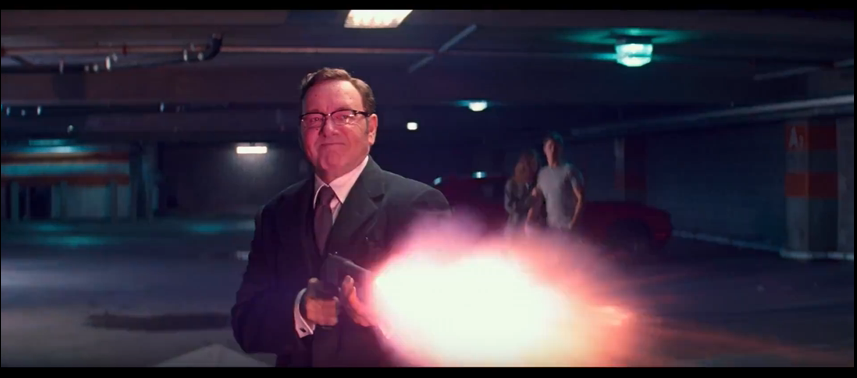
Next  it transitions smoothly into the darker side of the plot with the boss. You can tell that this character played by Kevin Spacey called "Doc" is his boss from the scary buisness look he gives off. Without even hearing the character speak it already feels like he is one of the antagonists.
Next it gives some back story on the main character and why he always listens to music. This is an important part of the plot so its good they included it in the trailer so people arn't confused. It also adds a bit more reason behind the fact hes always listening to music, than just a first impression from a viewer that he just likes it.
Yet again another little easter egg. In the ipod he is playing "Nowhere to Run" which is the song played in the trailer along with the lp at the begining. I love it when trailers have such an attention to detail that you discover more when you analyse frame-by-frame.
By including this manouver in the trailer. The film has now told the audience that there are going to be near-impossible stunts pulled off in the car. This shows the talent of the Driver and is not over-dramatic like a fast and furious trailer. It gives the audience a taste of what the car action scenes are going to be in the film.

"Now, I don't have to give you the speech about what happens when you say no,
how I could break your legs and kill everyone you love, but you already know that, don't you?". This is where the film takes a dark turn so you can clearly see in the trailer whats going to happen in the film. Baby doesn't want to be involved in crime now he cares about Debora. This scene is to show the audience that they are in love.
"The moment you catch feelings, is the moment you catch a bullet." Hes saying to baby that his girlfriend is going to get him killed. This shows that the people he is helping are very dangerous to be around hinting towards the change.

This scene shows three men in masks about to do an armed robbery. In the background you see Baby in the car waiting. Gives another insight of what kind of action you should be expecting in the film.
The title cardss pop up with unique artwork that has been connected to Baby Driver. The first one has his signiture sunglasses in the background. 
#
The second title card has earpod jacks in. This is because they are significant to Baby as hes using them all the time.
This scene connotes a gun dealing is taking place. This tells us that their doing bigger things than just robbing banks.
In this scene she looks so inncoent with fluffy clothes ping nails and a lolipop in contrast with her shooting people violently.
In this scene Lily James' character, Debora, looks towards baby worried about whats going to happen. Despite this Baby looks composed showing little to no emotion.
This shot is really well constructed. The guy on the right (Buddy) looks like a shadow or a reflection of the girl on the left (Darling). Its like an angel and a devil shot however they are both equally as crazy and bad.
"It's time to face the music" This is a good play on words as the entire film is focused around music.
They broke the tension with a joke about one of the guys getting the masks wrong. The joke is that he got Mike Myers masks which is a funny actor and not Micheal Myers the main antagonist from the horror film 'Halloween'.
This scene looks like someone has been shot. Debora looks like shes in a state of shock about whats happening.
This scene could be interpreted in two ways. Either it is Doc saving Baby and his girlfriend Debora or it is him killing someone they love. He does this with the voice over saying "you choose who dies".


To conclude, watching this trailer alone would convince me to see the film at the cinemas. It is perfectly crafted to cater to many different audiences, its funny, it has car stunts, action, violence and music. With this variety it is a very appealing film.