Friday, 13 April 2018
Question 1: In what ways does your media product use, develop or challenge forms and conventions of real media products?
For our A2 coursework our group decided that we would choose
the brief which included, creating a film trailer, a cover for a film magazine
and a film poster. Due to this we had to research the conventions of each to
enable that we made our product look professional.
Firstly, a main convention of film trailers are the titles,
our trailer conforms to this as we have included titles. The variation of
titles depends on the genre of film, however most trailers have a conventional
set of titles. The titles that we included in our trailer were;
1. Production
Companies
2. GreenBand
3. ‘This
Summer’
4. ‘From
the Director of Decorum’
5. Names
6. Slogan
– ‘ When Deaths Clock is Ticking Time Becomes The Enemy’
7. Title
8. ‘Summer
2018’
At the beginning of the trailer the audience ae presented
with the production companies, this informs the audience on who has produced
the film. Commonly, film productions can display the budget of the film as it
can either be a conglomerate company or an independent company. Also,
particular companies are known for producing certain genres of film. As our
film trailer is a thriller we decided to use ‘Lionsgate’ as this is known for
producing thrillers. Aswell, as using a generic production company we also
created our own independent company – ‘Vector Productions’, symbolising that an
independent company is in partnership with one of the big six’s.
Conventionally, most trailers also specify if their trailer as either
‘Greenband’ or ‘Redband’ which alerts the audience to the nature of the
trailer/film. Our trailer would be classed as a ‘Greenband’ as it contains no
bad language and little violence. Having the trailer rated at ‘Greenband’
allows for more publicity as it can seek an larger audience. Another title that conventionally appears in
trailers is the date/ season that the full length film is going to come out. So
in our trailer we have stated that it will be released ‘This Summer’, ‘Summer
2018’. Throughout, trailers titles such as; Names of the actors and information
about the director is displayed; in our particular trailer we have informed the
audience of our names aswell as stating that this film is a sequel to Decorum
(Our AS project). We stated ‘From the Director of Decorum’ as the audience are
then aware of the type of film its going to be, a rough idea of the story and
the directors film style which may attract a particular audience.
Another convention that our trailer conforms to is character
introduction. In most trailers, the audience are introduced to the main
characters of the film, however, in some instances characters may not be
introduced as they could be used as a surprise element in the film as the
audience would be unaware of them. However, in our trailer we introduce the 3
main characters including the antagonist and protagonist. We introduce these
characters as it allows the audience to get a feel of the nature of the film
and an insightful grasp on what to expect from the full film. Although, we have only introduced the characters
briefly displaying minor characteristics that entice the audience making them
want to find out more meaning they watch the feature film; this is a typical
stereotype of trailers.
One of the main conventions of a film trailer, is the title
of the film. Without the title of the film being displayed the trailer would
have no value to the audience as they don’t know what it is. Diue to this we
have included the title of the film hallway through the trailer which somewhat
challenges the stereotypes of film trailers as titles are often displayed at
the end as it is thought that it makes it more memorable for the audience.
However, we decided to put the title of our film in the middle of the trailer
after we introduced the characters, we purposely did this as after the title we
included a short piece of the torture scene to give the audience a glimpse of
what to expect. As this short action scene has a narrative structure (which is
unusual for film trailers) we decided to put it after the title as it could be
seen as somewhat a sneak peek of the film.
When conducting research during this project we found out
that trailers have to be between a certain lengths of time. The motion picture
association of America (MPAA) states that all trailers should not be longer
than two minutes and thirty seconds. Our
trailer conforms to this and would be acceptable as it is just under 2 minutes
of length, when producing the trailer we found it hard to believe that people
could produce trailers for longer than 2 minutes 30 seconds without revealing
to much about the film.
Another convention of film trailers is the use of music, in
most trailers some kind of music is used whether this being diegetic or
non-diegetic. In our trailer we have both non-diegetic and diegetic music to
conform to the conventions of trailers, we used two different non-diegetic
soundtracks which were added for numerous reasons such as: conveying the genre,
complementing the actions on screen and providing the audience with suspense
and tension. We also used diegetic sounds in the trailer when the antagonist
punches and stamps on the protagonist; we included this to add emphasis on the
violence and action which connotes the genre of the film. Aswell, as including
music, voice overs are a genre trope of trailers as they provide the
information with information. We used a voiceover at the beginning of the
trailer to inform the audience that the protagonist is a student who is going
to film their media project in an abandoned barn. Later on in the trailer,
another voice over is used as the news reporter informs the audience of the
information about the antagonist, this creates both suspense and tension.
The film trailer that we produced is for the thriller genre
meaning alongside the conventions of a trailer, we also had to meet the
conventions of a thriller. This was particularly easy as last year’s coursework
was based on thriller openings meaning we already had a broad knowledge on the
conventions, however, as it is a trailer not all of the conventions need to be
displayed. The main convention of the thriller genre that needs to be
considered in trailers is:
·
Suspense and Tension
Throughout thrillers there is a clear sense of suspense and
tension which is displayed in many ways:
1. The
music adds suspense and tension to the actions onscreen
2. Camera
Angles
a.
Close Up
b.
High Angle Shot
c.
Zoom Out
3. B-Roll
Footage – As it is a trailer we used B-Roll footage throughout, some of this
footage conveys suspense and tension throughout
a.
High Voltage Sign
b.
Antagonist walking banging metal rod
c.
Barbed Wire
4. Torture
Scene – The whole of this scene provides the audience with both suspense and
tension
5. Characters
– The protagonist is an ordinary person who is affected by unusual events
·
Protagonist vs Antagonist
Most thrillers contain an aspect of Protagonist vs
Antagonist and this holds most of the storyline/plot. Through our trailer there
is a clear distinguish between the antagonist and the protagonist, however,
during the trailer it is heavily dominated by the forceful antagonist.
Aswell as creating a film trailer we also created both a
film magazine cover and a film poster for our film. This meant that we had to
research the conventions of these so we could recreate a professional
representation of these. Firstly, the
film magazine conformed too many of the conventions of a typical magazine
cover. We used a famous magazine as a template ‘Empire’ and followed the
conventions and layout of their front covers. We included most aspects that are
typically included on the front cover:
·
Title of the feature film
·
Puff
·
Main Image
·
Sub Topics
·
Barcode
·
Main Kicker
This is just some of the conventional features that can be
seen on a magazine front cover.
In addition, our film poster also conforms to the
stereotypical poster as it contains all the generic features:
·
Slogan
·
Main Image
·
Film Title
·
Main Actors
·
Credits
Wednesday, 11 April 2018
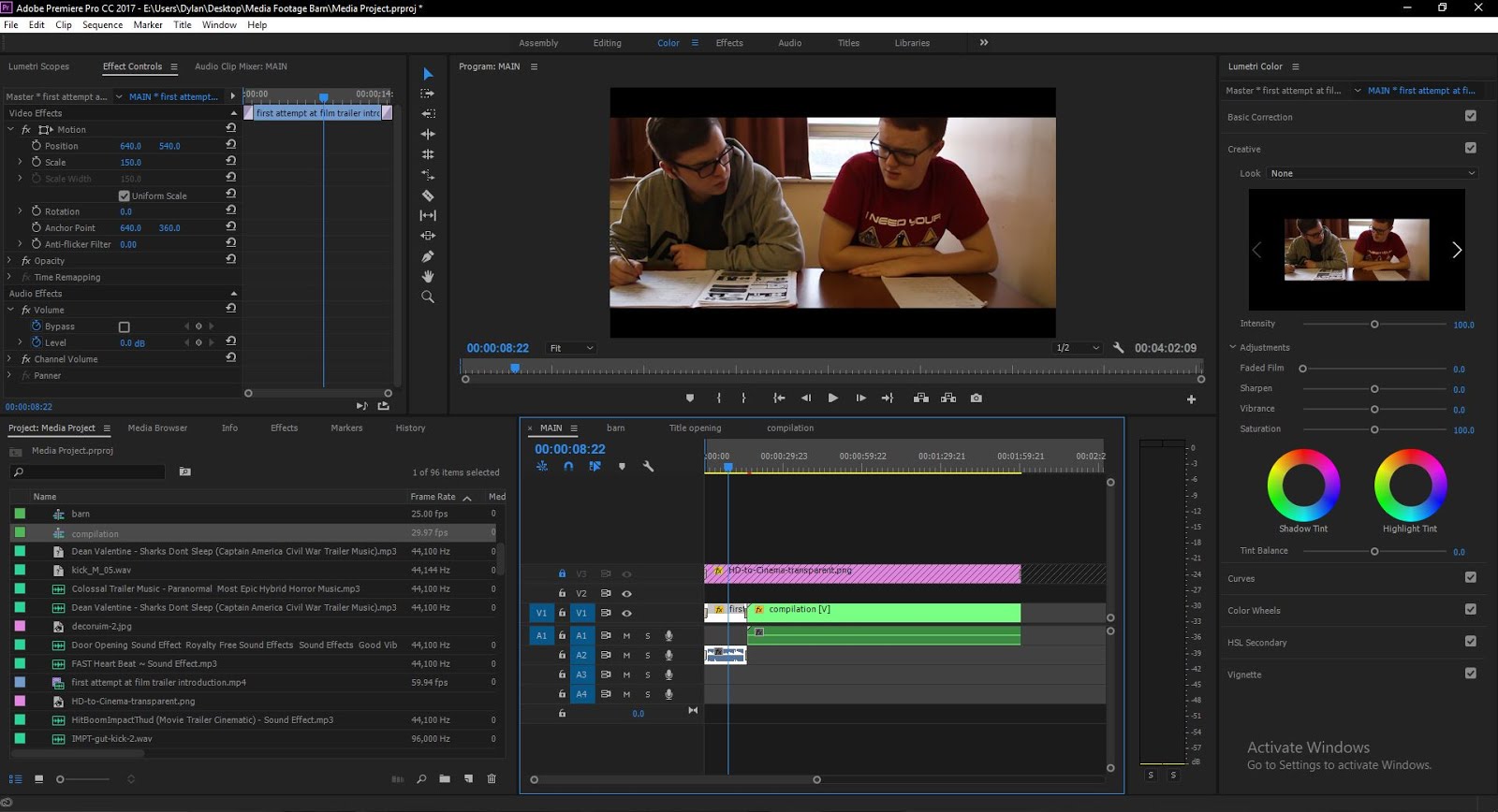
Post Production
Post production was definitely the hardest part of making the film trailer. We went through many different trailers as our ideas varied so I had to keep re-adjusting or changing the video and try and make use of the footage we had got. For the film trailer I used Premiere Pro.
Below I have wrote about how i edited the trailer:
First thing I did to edit the trailer was to split the film into different sequences in Premiere Pro. I had learnt this technique through my work experience with film company, ASA Productions. Basically I split the main parts of the film into different timelines and have one 'master' or 'main' timeline which I put the finished sequences in. This was useful to speed up productivity and make the timeline a little less messy so I could focus on certain parts of the film trailer without interfering with the rest of the film trailer.

Now I will focus on those said sequences in different sections if there is a specific section you want to look at.
Main
'Main' is pretty self explanatory. I added the compilation which I had moved the title opening and barn scene in which I will explain later along with the first clip of the school opening. If you notice I do not have a sequence of the first scene and is just a video I put in the start. That was because I had previously rendered that scene and felt like it didn't need changing so I just imported it in to save time.
The "HD to cinema transparent.png" was the black bars I put on top. I am aware you can just use masks and crops, there are many ways around making the black bars. However this is the way I have always done it. I have no need in the trailer to move the black bars for dramatic effects so I just added it to the top of the main sequence and locked it so I wouldn't accidentally move it when trying to move something else.

Barn
'Barn' sequence is where a lot of editing is straight away noticeable. Even though some of this sequence got cut in the final trailer, I will still go in-depth about it.
When I properly zoom in, which you will see in a screenshot below you can see the audio waves and the cuts I have made in correlation to them. Some of the scenes, and the most noticeable one where Jak's face is first shown has many cuts when the music peaks. This overall adds to a trailer. Through much research the best trailers have cuts which are in sync with the music.
Title Opening
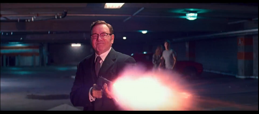
'Title Opening sequence consisted of three main clips. The first was the vector productions logo we already had for the previous film we did. This is our made-up film production company. After that you see a 'Lionsgate' logo. This was slightly sped up to fit with the music. The last clip was the company 'MARV', this was taken from the film 'Kick-ASS 2' I also added hits in the audio when the clips start.
Compilation
The 'compilation' sequence was full of many cuts, probably the most in any of the other sequences.To make the video in sync with the music i went through and made a marker every time there was a loud 'hit' in the song. After doing this I was able to quickly edit the clips so that they were in sync with the song. I believe this worked really well in the trailer as it is a technique used in most action trailers.
Below I have wrote about how i edited the trailer:
First thing I did to edit the trailer was to split the film into different sequences in Premiere Pro. I had learnt this technique through my work experience with film company, ASA Productions. Basically I split the main parts of the film into different timelines and have one 'master' or 'main' timeline which I put the finished sequences in. This was useful to speed up productivity and make the timeline a little less messy so I could focus on certain parts of the film trailer without interfering with the rest of the film trailer.

Now I will focus on those said sequences in different sections if there is a specific section you want to look at.
Main
'Main' is pretty self explanatory. I added the compilation which I had moved the title opening and barn scene in which I will explain later along with the first clip of the school opening. If you notice I do not have a sequence of the first scene and is just a video I put in the start. That was because I had previously rendered that scene and felt like it didn't need changing so I just imported it in to save time.
The "HD to cinema transparent.png" was the black bars I put on top. I am aware you can just use masks and crops, there are many ways around making the black bars. However this is the way I have always done it. I have no need in the trailer to move the black bars for dramatic effects so I just added it to the top of the main sequence and locked it so I wouldn't accidentally move it when trying to move something else.
Barn
'Barn' sequence is where a lot of editing is straight away noticeable. Even though some of this sequence got cut in the final trailer, I will still go in-depth about it.
When I properly zoom in, which you will see in a screenshot below you can see the audio waves and the cuts I have made in correlation to them. Some of the scenes, and the most noticeable one where Jak's face is first shown has many cuts when the music peaks. This overall adds to a trailer. Through much research the best trailers have cuts which are in sync with the music.
Title Opening
'Title Opening sequence consisted of three main clips. The first was the vector productions logo we already had for the previous film we did. This is our made-up film production company. After that you see a 'Lionsgate' logo. This was slightly sped up to fit with the music. The last clip was the company 'MARV', this was taken from the film 'Kick-ASS 2' I also added hits in the audio when the clips start.
Compilation
The 'compilation' sequence was full of many cuts, probably the most in any of the other sequences.To make the video in sync with the music i went through and made a marker every time there was a loud 'hit' in the song. After doing this I was able to quickly edit the clips so that they were in sync with the song. I believe this worked really well in the trailer as it is a technique used in most action trailers.
Thursday, 5 April 2018


Group Roles
Our Media Studies group consisted of three people, me Jak and Isaac. We worked together really well and were good in each of our individual roles in the group. Research and planning wise we all did our own research, however we did let each other use bits and pieces of the work to help assist each other, for example Isaac is more knowledgeable about different parts of the film and I might be more knowledgeable about the technical aspects. Saying this we have all grown as a group and become really good at making these projects and working well.
Jak- Jak did an amazing job at portraying a serial killer. He did a good job at making a believable character through his acting. Jak also provided a great amount of support with camerawork, editing and all round tasks done with the group. It was extremely useful that Jak knew how to drive, meaning we could get to filming locations which we wouldn't have been able to otherwise. Jak put a lot of work into the planning, especially the shot list and title cards. Jak got into contact with the music artist in which owns the song we wanted to use and got permission to use it, which was crucial to our film trailer.
Isaac- Isaac did loads of work to plan the film and gave very good ideas. He also got our main filming location (the barn) which was amazing. He created a template for the magazine cover in which I used to make the magazine cover. Isaac also played the main protagonist in the film trailer. Isaac also helped with camerawork and editing.
As for my roles in the group I was the main editor. I edited the film and also made the magazine cover and the poster. I did a lot of acting for the short film. I also did some camerawork and helped with storyboards and planning.
Wednesday, 28 March 2018
Film Trailer Overview
Title- Decorum 2, A Dead Mans Grasp.
Age Certificate- 15, this is the ideal for our film.
Genre- This is in the Thriller Genre.
Trailer Band- The trailer is going to be classified as Red band, this is because there is a very strong theme of violence, sexual references and graphic language.
Plot Overview- Two teenagers plan to go to an abandoned farm where a murderer used to stay for their school project. When one arrives the other is missing. It is presumed the boy is dead but his friend doesn't believe that, despite everyone else thinking that (connoted from missing poster in puddle).
Film Institution- We have gone with 'Lionsgate' which supports independent films. We have also gone with 'MARV' and our own personal company, 'Vector Productions'.
Tagline- "When deaths clock is ticking, time becomes the enemy".
Tuesday, 27 March 2018
Storyboard
Throughout making our film trailer we went through loads of different storyboards and different film ideas. Below is the final storyboards which Isaac drew up and wrote the directions onto.The last storyboard was B-Roll ideas which I was thinking about.
 |
(From left to right):
1. Introduction Company Logos:
'Vector Productions' - our own, fictional company, reinforcing how this is an independent film
'Lionsgate' - a more popular, profitable independent company, known for producing good films.
'Marv Films' - known for releasing high standard films (including thrillers such as 'Kingsman').
2. A car pulls into frame on a farm. It is bright, daytime.
Off-screen dialogue of two people discussing the arrest of an infamous serial killer. J-Cut. Close up.
3. Two students discuss filming at an abandoned hideout of the serial killer. Two shot, medium shot.
4. Steve stands outside of the barn waiting for Max. He holds his phone, looking at the time. Wide shot.
Steve's character is isolated on the right hand side of the frame.
5. Close up shot, zoom out to mid shot. Steve stares through opening of barn door but is scared away by something inside.
6. Wide shot - Silhouetted murderer opens barn doors. Time has clearly passed, since it is late afternoon outside.
7. Close up of murderer's legs. The murderer slowly approaches his victim, Max. He walks slowly, but purposefully. Camera tracks his movements.
8. POV - The murderer comes towards Max, punching him in the face and sending him collapsing to the ground.
9. POV - Max is being dragged away by the murderer. He reaches for a metal pole. The murderer realises this, drops him, and turns to face Max.
|
 |
| 1. POV - the murderer leans close towards Max. His face is smeared with blood, inferring the torture Max has supposedly endured. Cut to black. |
 |
| (From left to right): 1. Close up of a wheel of an abandoned bicycle. In the background, somebody is sprinting away, having just dropped the bike. Deep focus. Camera pans upwards. Afternoon. 2. A man steps into frame from the left. His stance is aggressive and firm. Between his legs stands opposite him his opponent, hooded and also prepared for combat. Static medium deep focus shot. 3. A missing poster of Max's disappearance lies face up in a puddle. A passing pedestrian walks through the puddle, sinking the poster further into the water. High angle shot. 4. Someone lights police documents with a cigarette lighter to remove evidence. Close up shot. 5. High angle, medium shot of lines of drugs on the table. 6. The word 'Decorum' is ominously seen on a wall, written in blood. (Could be at crime scene?) 7. Close up of a person's face. |
Friday, 23 March 2018
Uses and Gratification Theory
Uses and Gratifications theory as developed by Bulmer and Katz suggests that media users play an active role in choosing and using the media. Bulmer and Katz believed that the user seeks out the media source that best fulfils their needs.
The uses and gratifications theory assumes the audience chooses what it wants to watch for five different reasons.
Information and Education – the viewer wants to acquire information, knowledge and understanding by watching programmes like The News or Documentaries.
Entertainment – Viewers watch programmes for enjoyment.
Personal Identity - Viewers can recognise a person or product, role models that reflect similar values to themselves and mimic or copy some of their characteristics.
Integration and social interaction – the ability for media products to produce a topic of conversation between people. For example who is the best contestant on The X-factor who which was the best goal shown on Match of the day.
Escapism – Computer games and action films let viewers escape their real lives and imagine themselves in those situations
Title Cards
To lengthen out our trailer and make it look as alike to a real trailer we decided to add title cards. Title cards are really good to interest the audience into watching the trailer, as the reviews may inspire them for example "5 STAR "Best film of 2017, the Guardian" or something similar to that. Also it can tell the audience their favourite actor is in the film, in case none of us are recognised actors so we are just adding them for effect. Below is a list of title cards we are thinking of including in our film trailer.
These are the title cards Isaac came up with which we could use:
"From the Director of DECORUM"
"This Summer"
"When Death's Clock is Ticking"
"Time Becomes the Enemy"
"Dylan Peach"
"Jak Main"
"Isaac O'Brien"
"Decorum: A Dead Man's Grasp. Experience it in IMAX. In cinemas September 21st 2018"
For the title cards, I believed just black and white title cards would look stale in our film trailer. I asked Jak what I should do and he suggested doing titles like The Walking Dead. This was a really good idea.
Magazine Cover
 Four one of our ancillary tasks we had to create a film magazine cover.
We went on a photoshoot to get the best photo of Isaac as the cover. We believed he would look best on the cover as me and Jak are on the film poster. I got Isaac to look directly into the lens, this is what you typically see in these magazine covers. The background is just a stock image of clouds with some curve adjustments, which overall looks good and fits with the theme of the magazine and the film in general.
Colour-wise I decided to go with a 'dark orange' theme. This compliments the picture and the film very well as it s a dark movie. This is typically seen in Empire magazines, where the originally red title gets changed to a different colour to support the film. This also applies to the puff at the bottom about the 'Hitchcock Special!'.
One small element which may be unnoticed is that Isaac's head covers the 'P' in the Empire text. This is seen a lot in Empire magazine covers.
To appeal to all audiences we added elements of the magazine such as 'the Hitchcock special' for the older more 'critic' readers, and 'on set with ready player one, etc..'.
In the bottom right corner of the poster you can read 'issue 182'. This is not typical for Empire magazine covers, however I felt like the corner was looked empty without it. This way it challenges the conventions of the magazine cover.
The descriptions on the right hand side of the poster, talking about Decorum and how it has "More Violence, More Suspense, More Thrills". This is to draw people into reading and consequently watching our film. By adding red text it pops in the magazine.
The typeface I used on "Decorum, a Dead Man's Grasp" is a very bold one. This is to make the title stand out so people are interested in this new film.
Wednesday, 7 March 2018


Equipment/Props/Software used
Equipment
Canon 1200D
This was the primary camera we used to film with. It was useful because it is a DSLR meaning that we can exchange different lens and focus easier.
Canon 700D
 To make the trailer believable as possible we each brought props to use. Jak bought a butchers apron for him to wear as the antagonist in the trailer. We wanted a butchers apron because it fits with the horror film, similar to how you see mad scientists like this one in the 2005 film "Hostel".
Fake Blood
 Missing Poster
Software
Premiere Pro CC 2017
Premiere Pro is the program I used to edit the short film on. This is one of the indusrty-standard editing softwares.
Canon 1200D
This was the primary camera we used to film with. It was useful because it is a DSLR meaning that we can exchange different lens and focus easier.
Canon 700D
Later during the filming process, we upgraded cameras to the Canon 700D. This DSLR has a microphone jack.
RodeGO Mic
This microphone was vital to making a proffesional film trailer as the in-built microphones in cameras are not very good.
Tripod
We used a generic cheap tripod to make sure the shots were stable.
Glidecam
For some of the shots we used a glidecam. Glidecam's are really good for showing movement but with little shake or stutter.
Props
Props
Butchers Apron
Fake Blood
We didn't want to use any tomato ketchup or anything similar as we wanted to make the film trailer look as good as possible. I purchased some fake blood off amazon which worked amazing. It looked really realistic and also dried like real blood and stained like real blood which added to the overall effect.
 Missing Poster
Isaac made a missing poster for himself. This was used in the film trailer to connote that people have stopped looking for him, as the poster is dated and on the floor in a puddle.
Premiere Pro CC 2017
Premiere Pro is the program I used to edit the short film on. This is one of the indusrty-standard editing softwares.
Photoshop CC 2017
Photoshop was used to create all the graphics such as the film poster and the magazine cover.
Soundtracks
For our trailer the most difficult part was finding a soundtrack which worked really well in correlation with the video footage. Luckily enough I found some music which would work well in our trailer.
The first was this horror music i found off youtube. This was good because it had lots of "hits" in it which was good to sync the edits to. This was used in the Barn scene because it is really tense and dramatic.

The first was this horror music i found off youtube. This was good because it had lots of "hits" in it which was good to sync the edits to. This was used in the Barn scene because it is really tense and dramatic.
The second piece of music we found for the soundtrack was a song I found called "The Way" by Zack Hemsey. This track was perfect for a film trailer, it is dramatic, full of "thuds" or "hits" and generally really good.
One probelm that we faced was the idea that our video was going to get a copyright strike if we uploaded our trailer, with a licensed song in it. However this was really quickly overcome as Jak emailed the artist Zack Hemesy, whom gave us permission to use the music in our trailer, as long as it is not for commercial use. Below is the said email for clarification purposes.
Tuesday, 6 March 2018
Finished Film Poster
After all the planning and feedback, this is the final poster I made for the film trailer.

Changes from first draft:
First obvious change is that the orientation has changed. After feedback which I talked about in my previous Ancillary blog post, i changed the poster to portrait. Overall I believe it looks a lot better than before.
Secondly i changed the text at the top. I changed the typeface and also changed the colour of the word "death's" to red. I think this was a good change as red is a symbolic word for death, therefore working well with the title.
I added the two apostrophes where needed in the poster as it was talked about and noticed a lot in the the feedback (see previous blog post on the poster).
Because my hand was kind of "jumping out of the scene" I edited Jak's head so it looked like it was coming out of the scene. This worked really well as it makes the picture of myself look like it was made to look like I'm reaching out of the picture, similarily to how they layer photos on film magazines such as Empire.
Finally one of the most potent changes is the fact I added another scene from our film trailer onto the poster. This is of Jak covered in blood. If you hadn't noticed I deliberately lined up the sides of Jak with the sides of my head so it looked really clean and in proportion.
Script
As part of our planning. Isaac made a script for our film Trailer.


We all had different ideas and we went through multiple re-drafts of making scripts, however we got some feedback from a recently graduated film student who has done paid work in the film industry making scripts. This was incredibly useful as he gave us a lot of constructive criticism on our script and how to make it like a proper 'film industry standard' script. This included how to introduce a character into a scene and how you have to give a trait for the character so the actor knows how to play this character. We were taught how to write the script as if we were giving it to a group of people with no idea and for them to be able to create the film trailer we wanted.
As for the methods we used to create the Script, we decided to use a website recommended by the said film student called 'Celtex' (click this if you want to see the website). This was really useful to write a script with as not only was it easy to use, free and filled with all the tools needed, you could also forward a link to the script through an email, message etc, to other members of the group so they could link up their account and collaborate on the script.
One problem we faced was creating some effective dialogue for our script. Jak and I helped Isaac with creating some natural dialogue for the script, however we established that dialogue wasn't going to be a main emphasis in the trailer and we were going to make it as small as possible.I believe one of the drawbacks would be using heavy dialogue in the trailer as we were not professional actors, so we decided to only use dialogue when was necessary for conveying the plot in the film trailer.
Here below is some screenshots of what our script looked like:
Sunday, 25 February 2018
Poster Feedback
After I finished creating the first poster, we went to get feedback on what we needed to change. Isaac posted a picture of the poster on social media to see what people thought about it.
 The general response was positive, however a lot of people picked up the punctuation errors in the poster. There were no apostrophes for "Death's" and "Man's". This was slightly frustrating as the fonts I used for the title were custom and actually didn't include apostrophes , therefore I had to make them custom with Photoshop.
Secondly I went and showed some students the film poster to get some feedback. I got some really good feedback from a student who is studying graphics design at a BTEC D* grade. He said that the landscape doesn't work with the poster. Originally we thought it was good to subvert the conventions of a film poster as it is unique, however from a public designers point of view it is portrait for a reason and that reason is it generally looks better. There is less unused space on the poster which means it is easier to get drawn into the bits you want the audience to see.
Finally I got some feedback from general people I know, asking them if there was anything they see that needs changing. One of those said people said the text at the top didn't look right, it was too far to the left and generally didn't work on an angle. I was soon to change that and have to admit looking back at it now i subconsciously was feeling the same way, I knew there was something that looked off about it but it was very useful having that second opinion on the text to point out what needs fixing.
Thursday, 22 February 2018
Magazine Planning
Isaac made a template on how the film trailer should be constructed. He also made the credits however I had to remake them due to resolution and scaling problems.


Thursday, 15 February 2018
Poster planning & First Draft
One of the Ancillary tasks was to create a film poster for the film trailer we are producing.

 Isaac and I had a Skype call where I started creating the poster. Within a few hours we had created the first draft poster and it looked really good to us.
 As for the typeface I thought a quite "grungy" look would work really well. It matches the theme of the film really well with all the barn scenes in the trailer. This bold typeface is common in thriller posters such as the one for the film "Black Rock". I decided to go with white and red as it not only fits with the genre and conventions of a thriller poster, but it generally just looks and works really well. Red is a really outgoing colour which pops on the poster.

Due to me being the only person in the group who is confident with Photoshop, I offered to make the poster for the group.
Isaac kindly created a plan for the film poster. I used it as a template to work off which helped a lot. Also Isaac wrote all the text which goes at the bottom of the poster, however I had to re-create it because or resolution issues with the picture.
 Isaac and I had a Skype call where I started creating the poster. Within a few hours we had created the first draft poster and it looked really good to us.
One thing we changed was the orientation of the poster. We decided that we could try making it landscape. By doing this we challenged typical conventions of film posters as they are typically portrait.
The main image we used was a shot of myself looking into the barn. We thought it was a really good shot to use and we could fill the black with the text instead of having to remove parts of another scene. The short is a slight dutch tilt with connotes that something isn't right.
 As for the typeface I thought a quite "grungy" look would work really well. It matches the theme of the film really well with all the barn scenes in the trailer. This bold typeface is common in thriller posters such as the one for the film "Black Rock". I decided to go with white and red as it not only fits with the genre and conventions of a thriller poster, but it generally just looks and works really well. Red is a really outgoing colour which pops on the poster.
Tuesday, 13 February 2018
Film Trailer ideas
Jak made a diagram of some ideas that we previously had for our film trailer.

Our ideas ranged from horrors to comedies and even some hybrid genre ideas came to our attention.
Jak summarized these ideas below.
Our ideas ranged from horrors to comedies and even some hybrid genre ideas came to our attention.
Jak summarized these ideas below.
- Thriller - During the trailer we would want to outline the plot, introduce the characters and include short action sequences. The idea that we has was that a mass serial killer is on the loose and has taken some school students. Throughout the trailer we would plan on having torture scenes, police investigation, flashbacks, montage scenes.
- Horror - During the trailer we would have jump scares, comedic horror and over the top reactions. We would base our idea on Halloween night where one country is entrapped and no-body can escape. Peoples fears will come to life, however, throughout the trailer we would follow two different groups (elderly, youth). This is what would provide the comedic aspect as we would present the teenagers as more scared and petrified.
- Action - During an action trailer their would be lots of fast action shots compiled together, an antagonist vs. protagonist and a female heroine. Our idea was that an innocent school teenager unfortunately witnesses something he shouldn't have and this causes a major downfall in his life. The teenager tries to seek help but matters only get worse. ]
- Comedy - Teenager based - crude comedy. Our idea was to have a group of friends reminisce about a girl they liked in Junior school, she was the most popular girl in school. However, many years later this group of friends see this girl at a gaming convention and become close friends with the girl. However, due to this relationship the group of boys are seen doing stuff to impress her and arguing with their friends.
Friday, 9 February 2018
IT- Trailer Analysis
IT, the mini tv series from 1990, based on the book by Stephen King, has been re-made into a 21s centry blockbuster film. Here I am going to breakdown the trailer and tell you why it is so effective. Personally when I saw the trailer I was very excited, the mix between the memorable scenes from the old mini series, to the characters and the actors chosen to play said characters.

The opening scene only lasts a few secconds but yet instantly makes an impact to the people who have either read the book or watched the previous 'IT'. The scene consists of close-up shots of Bill making the boat for Georgie. This makes an impact because people will remember the famous gutter scene. Instantly when a viewer sees this scene they are reminded of the film and how scary the previous was.

Next it shows Georgie going close up to the gutter and IT jumps up in "jump scare" way. This is effective at showing the audience that they are in for a lot of scares.

It then cuts to a title card. This tells the audience that it is from a book Stephen King wrote. Stephen King is a famous writer known for his work in the Horror and suspense also writing books which have turned into horror films such as Carrie and The Shinning.

Straight after you get introduced to the main case. This is such a well constructed shot wide angle shot.

Next it cuts to scenese of the kids and the school in the town. A narrator who is a child is talking about how people are dissapearing 6 times the national average. This above is a very well thought out and constructed shot. It shows a missing poster, however if you look closely there are bits of peper to the left. This is from a previous poster of a missing sign which connotes recent dissapearances. Added to that all the nails in the pole tells the audience that there has been many missing posters before this.

This is a typical setting for a horror film, a "haunted house". In this case it's a burned down house but it still has a very eerie vibe.

The use of the child taking the inhaler is not only comedic in a way but it connotes a disturbance has happened.
After this it goes into more compilation scenes with the title cards which read "What are you afraid of?" This adds to the trailer as there is non-diegetic sound of creepy laughing. This overall adds to the tone of the trailer making it very scary.
It finishes with a jump-scare which is to scare the audience and give them a taster of what film they would be going to watch. If it scared the audience this could be a good thing and a bad thing. It could scare the viewer from watching the full film, or it could make them want to watch it more as it could be argued that most modern films are not very scary.
Friday, 26 January 2018
Film Poster analysis #2 Pulp Fiction

First thing I can take from my first glance at this poster is that it is in a comic book style. This may be appealing to people who at the time read them and was instantly hooked by the image. You can tell this by the 'comic title' and the '10c' icon.
Seccondly above the title is "Winner best picture- 1994 cannes film festival). The Cannes film festival is a huge film festival where film buffs from all over the world meet to watch "art house films" and new releases or ideas. The fact that it says they won best picture will interest film buffs, consequently drawing them to watching the film.
Next there is a huge list of actors going down the left side. Instantly the names John Travolta, Samuel L. Jackson, Uma Thurman and Bruce Willis catch my attention. Big stars at the time would attract fans to watching their film.
Underneath the pulp fiction text it says "a Quentin Tarantino film". With Quentin Tarantino's reputation for making amazing films, this could be a reason alone for people to watch the film.
Overall this poster is eye catching. With its colours that pop-out and all the stars and the director included, it makes for a great film poster.
Friday, 19 January 2018
Baby Driver In-Depth Film Trailer Analysis
I have got to start of by saying, not only is Baby Driver my favourite film of 2017, but also it is my favourite trailer. Everything about this film is incredible, the plot, the cinematography and most of all, the music. This is definitely a staple for good film trailer and as I analyse it now in depth, it will soon be clear why.

Opening shot is the production/distribution companies printed on vinyl in a Jukebox. This already tells the audience that this film is related to music which it is. Then the machine cycles to a record and plays it. If you pay attention you can see the record is "Nowhere to Run", by Martha and the Vandellas. This is the song which is played in the trailer, to a keen eye this is a very cool "Easter egg".


Their conversation is overlayed with Baby driving away from the police. This is really effective as Debora is talking about his job thinking that it is legitimate. For example in this scene below she says "oh, like a chauffeur" when he has criminals in the car. Added to that she asks "anyone i'd know?" with the response "I hope not" which is quite comedic for a Crime Thriller.
 The fact that the main characters name is baby "Baby" is repeated constantly during the film trailer, they want you to know from the start who he is and whats his story as this is a single charcter driven plot.
 Next it transitions smoothly into the darker side of the plot with the boss. You can tell that this character played by Kevin Spacey called "Doc" is his boss from the scary buisness look he gives off. Without even hearing the character speak it already feels like he is one of the antagonists.
 Next it gives some back story on the main character and why he always listens to music. This is an important part of the plot so its good they included it in the trailer so people arn't confused. It also adds a bit more reason behind the fact hes always listening to music, than just a first impression from a viewer that he just likes it.


 #
#


 This shot is really well constructed. The guy on the right (Buddy) looks like a shadow or a reflection of the girl on the left (Darling). Its like an angel and a devil shot however they are both equally as crazy and bad.
 "It's time to face the music" This is a good play on words as the entire film is focused around music.
 They broke the tension with a joke about one of the guys getting the masks wrong. The joke is that he got Mike Myers masks which is a funny actor and not Micheal Myers the main antagonist from the horror film 'Halloween'.
 This scene looks like someone has been shot. Debora looks like shes in a state of shock about whats happening.
 This scene could be interpreted in two ways. Either it is Doc saving Baby and his girlfriend Debora or it is him killing someone they love. He does this with the voice over saying "you choose who dies".
To conclude, watching this trailer alone would convince me to see the film at the cinemas. It is perfectly crafted to cater to many different audiences, its funny, it has car stunts, action, violence and music. With this variety it is a very appealing film.

Opening shot is the production/distribution companies printed on vinyl in a Jukebox. This already tells the audience that this film is related to music which it is. Then the machine cycles to a record and plays it. If you pay attention you can see the record is "Nowhere to Run", by Martha and the Vandellas. This is the song which is played in the trailer, to a keen eye this is a very cool "Easter egg".

After that it cuts to inside a diner where Baby (Ansel Elgort), is sitting. Then it cuts to Debora (Lily James), smiling ready to take his order. Straight away she looks interested in him smiling and asking him questions about his job. This connotes that Debora is a very innocent, happy character which contrasts with Baby's illegal driving. In an interview with Edgar Wright, the director for Baby Driver, he says that Baby has been going to the same diner for years as part of his routine and she is the new staff member. This also may explain or be connoted by the way she presents herself, very clean and "posh" looking with the jewellery hinting that she is not like over motel employees.

The music when the actual driving is shown is amazing. They use a technique that is commonly used in trailers where they go from high impact music to no music back to high impact music within the space of a few seconds. Its hard to explain with words how good it is you just have to listen yourself.


Yet again another little easter egg. In the ipod he is playing "Nowhere to Run" which is the song played in the trailer along with the lp at the begining. I love it when trailers have such an attention to detail that you discover more when you analyse frame-by-frame.

By including this manouver in the trailer. The film has now told the audience that there are going to be near-impossible stunts pulled off in the car. This shows the talent of the Driver and is not over-dramatic like a fast and furious trailer. It gives the audience a taste of what the car action scenes are going to be in the film.

"Now, I don't have to give you the speech about what happens when you say no,
how I could break your legs and kill everyone you love, but you already know that, don't you?". This is where the film takes a dark turn so you can clearly see in the trailer whats going to happen in the film. Baby doesn't want to be involved in crime now he cares about Debora. This scene is to show the audience that they are in love.

"The moment you catch feelings, is the moment you catch a bullet." Hes saying to baby that his girlfriend is going to get him killed. This shows that the people he is helping are very dangerous to be around hinting towards the change.

This scene shows three men in masks about to do an armed robbery. In the background you see Baby in the car waiting. Gives another insight of what kind of action you should be expecting in the film.

The title cardss pop up with unique artwork that has been connected to Baby Driver. The first one has his signiture sunglasses in the background.
 #
#
The second title card has earpod jacks in. This is because they are significant to Baby as hes using them all the time.

This scene connotes a gun dealing is taking place. This tells us that their doing bigger things than just robbing banks.

In this scene she looks so inncoent with fluffy clothes ping nails and a lolipop in contrast with her shooting people violently.

In this scene Lily James' character, Debora, looks towards baby worried about whats going to happen. Despite this Baby looks composed showing little to no emotion.


To conclude, watching this trailer alone would convince me to see the film at the cinemas. It is perfectly crafted to cater to many different audiences, its funny, it has car stunts, action, violence and music. With this variety it is a very appealing film.
Subscribe to:
Posts (Atom)
-
 IT, the mini tv series from 1990, based on the book by Stephen King, has been re-made into a 21s centry blockbuster film. Here I am going t...
 -
 If you asked anyone if they knew what the film Pulp Fiction was, most likely they would. This is one of the worlds most popular films but ...
 -
Over the years the techniques to promote a film have evolved as technology has gotten better and more accessible. Here I have broke down the...
